ITVMO Website Redesign
The ITVMO site revamp flipped an old government website into a contemporary and user-friendly one in just three months. I used the PURE Method and Miro for user journeys, designed for usability, added a CMS for content management and provided a responsive, accessible layout that allowed stakeholders to take control of the site themselves.
Redesigning The ITVMO Website On A Tight Deadline
Redesigning the ITVMO site was a given when the job was presented: redesign an outdated and cumbersome website into a user-friendly, modern web presence with a built-in content management system (CMS). This redesigned approach would let Business Analysts and Project Managers work on content updates without having to rely on a developer. The challenge was too much with only 3 months to complete it; comprehensive user research, design and CMS integration, with only one developer. So here is a breakdown of the redesign.
Challenge and Timeline
The first was the outdated condition of the ITVMO site. It was not easily navigable, cluttered and didn’t provide a good user experience where users could not even do simple tasks such as searching for documents or creating requests. Also, the redesign would have to allow non-technical employees to take control of content on the website and for that, an intuitive CMS had to be introduced.
It was very short notice, only three months. In this time I had to:
- Be sure to do user research to figure out where problems are and what can be improved.
- Update the website so it’s easy to navigate and visually attractive.
- Work with a developer to setup a CMS that was in accordance with the new look.
The resource was at a premium and the project had to be structured and executed effectively to make it successful.
Research and Analysis
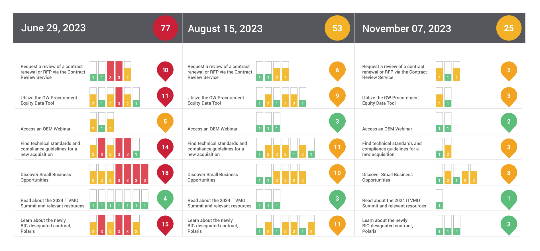
Due to the lack of direct access to users for feedback, I used the PURE Method to test the previous site. This was to divide tasks that were essential (getting around, accessing resources, filling out forms, etc.) and score them based on ease of use. The testing showed numerous usability issues like the lack of call-to-actions, the non-organized content, and the messy navigation. These observations were the basis for the reengineering plan.
To flesh out the UX further, I built user journeys and content stacks with Miro , a shared online whiteboard. These graphs provided a visual representation of user behaviours in the new site, and areas where workflows could be automated. I e.g., charted the user’s path from finding to downloading a policy document and identified how this process could be made easier.
This PURE Method and user journey mapping combined enabled me to design with best practices and usability in mind even when I had no direct feedback from users.
Ideation and Design
We had three important aspects in mind during design: Usability, Design, and Functionality.
- Simplified Navigation: Navigation was the first priority. I changed the site’s information structure to be intuitive so users could find what they were looking for without too much digging. The layout was reorganized to be task-oriented and direct users to key activities such as downloading resources or reaching out to support without clutter.
- Better User Interface: The website was made contemporary and professionally designed. This included having the same color palette, simple typography and visually distinct pages for readability. We also considered accessibility as the design was designed to be WCAG compliant for everyone.
- Compatible CMS: In order to empower non-technical team members, I collaborated with the developer on a solid CMS (WordPress, Drupal, etc.) The CMS was easy to use and Business Analysts and Project Managers could edit content, manage navigation menus and upload documents by themselves. I also made sure that the CMS dashboard was in-contrast to the design of the site, and that editing and navigating through the site was seamless.
During this phase, I worked with Axure to build high-fidelity prototypes and iterated with the developer to get the technical implementation right on-point with the design vision.
Execution
When the design was complete, it was time to build. The website was built to be fully responsive, and so it could work on any screen. Containerized elements (resource cards, contact forms, announcement pages) were designed for easy CMS update. Micro-interactions such as hover states and progress bars were implemented to support tasks and add user-experience value.
CMS templates had to be flexible and easy to use, allowing stakeholders to operate the site without violating its appearance or functionality. I also ran training for the Business Analysts and Project Managers in the team to make it a smooth transition, so they can learn how to operate the CMS.
Testing and Iteration
When the site was live, I tested usability with the PURE Method to see how easy it was to use for certain tasks. I tested, for example, if users would be able to navigate to a certain policy document or complete a contact form easily. The tasks were all scored against the PURE rubric pointing to areas of friction and need for refinement. The more complex (e.g., 3) friction scores were investigated at greater detail and remedial actions were taken including error message improvements, tooltip improvements, and navigation labels simplicity.
Through this iterative method, I was able to continuously update the usability of the site after launch so it would always serve the user’s and stakeholder’s needs over time.
Final Outcomes
The ITVMO website had been redesigned to make it easy to navigate and very attractive, which made the overall user experience far better. Navigation was made easy, tasks were completed faster due to a more organized layout and content. With its built-in CMS, Business Analysts and Project Managers were able to maintain content themselves, without having to work with developers, and get updates faster.
Usability of the site was also always an ongoing effort using the PURE Method after the website went live. Always doing periodic tests and updates made sure that the experience was constantly improved, fixed as problems occurred and the user experience improved overall.
Key Takeaways
This was a project that showed the value of flexibility, productivity and teamwork to produce quality output in a short timeframe. I was able to translate an old site into a dynamic and scalable platform that caters to users and stakeholders using structured techniques such as the PURE Method and best practices in UX design. The ITVMO website has now proven that good design and iteration do not fail.
- Category : UI/UX Design & Development
- Date : 06/21/2023
- Client : GSA


