
Case study 05 Capital One
Financial Management Tool
Twenty-nine features, four questions, and a decision not to give advice.
- Client
- Capital One
- Product
- Budgeting and goal-setting tool inside the Capital One iOS app
- Role
- UI/UX Designer, end-to-end ownership
Summary
A budgeting tool that refuses to become a second job.
Most people who try a budgeting app stop using it once keeping the numbers accurate becomes a second job. You set it up on a Sunday full of good intentions, categorize forty transactions, and three weeks later you have not opened it since.
This tool was built against that problem. It sits inside the Capital One app rather than beside it, which means it already knows every transaction, already knows who you are, and never asks you to sign up for anything.
I owned the design end to end, from an unsorted feature list through research, prioritization, flows, high-fidelity screens, an interactive prototype, usability testing, and a component library that engineering built from.
The decision I am most confident about is one that does not appear on any screen. Eight of the twenty-nine candidate features would have given people financial advice, and not one of them was in the first release.
These are my own prototype screens with placeholder account data. No real customer information appears anywhere.
The constraint
The constraint that came before any design work.
The tool opens inside the Capital One app, from the account home screen with a swipe, underneath the checking balance, credit card and credit score. That was decided before I started, and once you take it seriously it settles a surprising number of arguments.
What it gives you is enormous: trust is already there, transaction data is already present, and there is no signup. What it costs is real too: there is no tab bar of its own, no app icon, and every pattern has to match the parent app.
The starting constraint
Built into the app people already trusted.
Three-step flow from the existing Capital One account home, through a swipe down gesture, into the budgeting tool. Two comparison panels explain what the constraint gave the design and took away, followed by the design question it produced.
Account home
The screen customers already open to check a balance. Checking, credit card, credit score.
Swipe down
One gesture, no separate login, no download, no new account.
The budgeting tool
Goals, budgets, bills and cash flow, sitting on transaction data already there.
What that gave the design
Trust already earned. Nobody had to be convinced this app should see their money.
Every transaction, balance and card already present, so budgets could be built from real history rather than manual entry.
No signup. The single largest drop-off point in personal finance apps simply does not exist here.
What that took away
No tab bar of its own, no app icon, no push notification channel that is not the bank's.
Every pattern had to match the parent app, because feeling outside Capital One would make something seem wrong.
It competes with the reason people opened the app: checking a balance in under ten seconds.
The design question this produced
How do you make something worth stopping for, inside an app people open to do one quick thing and leave?
The design process
Less work became the product principle.
I started with requirements analysis alongside business stakeholders, then talked to people who already used budgeting tools. I had assumed people wanted more control over their money. What they actually said was that they wanted less work. That correction reshaped the feature list.
Low-fidelity flows came first, mapped around the paths a person takes: set a goal, build a budget, track a bill, read the trend. Then came high-fidelity screens, an interactive prototype, usability sessions, A/B comparisons on calls to action and navigation, and a build with engineering aligned to iOS Human Interface Guidelines.
Design process
Six phases, with a concrete output from each.
Six-phase design process table: exploration and investigation, brainstorming and strategising, design, testing the usability, iteration and development, and launch and post launch. Each phase has an activity description and a concrete output.
| Phase | What happened | Output |
|---|---|---|
| 01Exploration and investigation | Requirements analysis with business stakeholders, then interviews with people who already used budgeting tools. The finding was consistent: tools were not too simple, they were too demanding. | Requirements, interview findings, the abandonment problem |
| 02Brainstorming and strategising | Twenty-nine candidate features, each tagged with the user goal it served, then sorted into four tiers with stakeholders in the room. | Prioritized backlog across four tiers |
| 03Design | Low-fidelity flows mapped around the paths people take: set a goal, build a budget, track a bill, read the trend. Then high-fidelity screens and a working interactive prototype aligned to iOS Human Interface Guidelines. | User flows, high-fidelity screens, interactive prototype |
| 04Testing the usability | Usability sessions on the prototype, plus A/B comparisons on calls to action and navigation. The goal was to find where people hesitated, not whether they liked it. | Usability findings and comparison results |
| 05Iteration and development | Navigation and specifications reworked against testing, then worked through the build with engineering. Quality control ran against the prototype rather than static mockups. | Revised specifications, component library across three core flows |
| 06Launch and post launch | Adoption and engagement tracked after release, with feedback fed into the next round of priorities. P2 and P3 were a queue, not a graveyard. | Post-launch feedback loop |
What the research changed
Going in, the assumption was that people wanted more control. What they said they wanted was less work. That correction is why automatic categorisation, suggested categories and sample plans made the backlog, while manual precision did not.
Prioritization
A feature list is a wish list until every feature has a goal.
The findings became twenty-nine candidate features. Every one got tagged with the user goal it served, then sorted into four tiers with stakeholders in the room rather than by me alone. The tagging made the sort a question anyone could check: which goals will ship, and which remain only ideas?
The backlog
Twenty-nine features, sorted into four tiers.
Four columns sort twenty-nine candidate features into eight must-have, thirteen nice-to-have, five surprising and delightful, and three that can come later. A bar chart shows the user goals attached to those features, led by budgeting at seventeen.
8 Must have
Ship without these and it is not a budgeting tool.
- Expense tracker
- Income tracker
- Customizable budgeting tool
- Summary reports
- Visual reports
- Custom categories
- Payment tracker
- Set goals
13 Nice to have
Real value, but the product works without them.
- Filters
- Compare feature
- Automatic categorization after purchases
- Reminders
- Alerts for overspending
- Notifications
- Add life events
- Suggested categories
- Sample plans to follow
- Aggregate receipts
- Collaboration with family member
- Emergency funds
- Essential/non-essential filter/tag for expenses
5 Surprising and delightful
The reason someone tells a friend about it.
- Educational tips
- Hypothetical scenarios
- Suggestions about where to save
- Report of unusual spendings
- Virtual advisor
3 Can come later
Parked deliberately rather than forgotten.
- Logging notes/thoughts
- Financial Coach
- Services integration
What the twenty-nine features were for
Budgeting is more than half of them.
Why tag every feature with a goal
A feature list is a wish list, and wish lists get sorted by whoever is loudest in the room. Tagging each one with the user goal it serves turns the sort into a question anyone can check.
The hardest decision
Advice is a promise. Accuracy has to come first.
Eight features in the backlog would have given people financial advice: educational tips, hypothetical scenarios, suggestions about where to save, reports of unusual spending, a virtual advisor, a financial coach, and service integrations. Not one was must-have. One was nice-to-have, five were surprising and delightful, and two were parked.
The easy version of this product ships the virtual advisor early. It demos beautifully and is what every stakeholder gets excited about. We did not build it. A budgeting tool has to be boringly accurate about what already happened before it earns the right to have an opinion about what should happen next.
The clearest decision in the backlog
Eight features would have given financial advice. None shipped first.
Eight advice-related features listed with their backlog tier and description. One is P2, five are P3, and two are Later. A rejected virtual advisor sits beside the shipped direction: accurate tracking of expenses, income, budgets and goals without advice.
| Tier | Feature | Description |
|---|---|---|
| P2 | Sample plans to follow | Pre-set sample plans for budgeting to give an idea to those who are not sure how to set up the budget |
| P3 | Educational tips | Short tips linking to longer descriptions about saving/budgeting suggestions to further educate users |
| P3 | Hypothetical scenarios | Run scenarios to show how much can be saved after giving data/using existing data and new expense/saving/budgeting categories to prepare for life events |
| P3 | Suggestions about where to save | Suggesting categories/goals where the user can save more based on previous spending summaries/reports |
| P3 | Report of unusual spendings | Tracking spendings that are not the norm to rethink the purchases and help plan for them |
| P3 | Virtual advisor | AI-based advisor giving suggestions and recommendations based on past behavior and budget/goals settings |
| Later | Financial Coach | Investment advice, saving advice |
| Later | Services integration | Integrate services such as groceries to suggest where/how to save based on where a user usually shops |
The version that would have been easy to sell
Ship the virtual advisor early. It demos beautifully, is what every stakeholder gets excited about, and is what a competitor would put on its landing page.
RejectedThe version that got built first
Track expenses. Track income. Let people set a budget and a goal in their own categories. Show it back accurately, every time, with no surprises.
ShippedThe reasoning
Advice is a promise. The moment an app tells someone where to save money, it has claimed to understand their finances. A budgeting tool has to be boringly accurate about what already happened before it earns the right to have an opinion about what should happen next.
Research evidence
Reading the backlog by category turns that first finding into something more specific than a feature list.
The research backlog
What the research said, matched against what shipped.
Research backlog grouped into three categories: seventeen items to keep it accurate without the chore, ten to watch a number get closer, and eight to tell the user what to do with what is left. The finding behind the split is that people wanted more control over their money but less work keeping track.
Not a persona: three patterns in the twenty-nine candidate features, sorted by the job each one was trying to do.
-
17of 29 features
Keep it accurate without the chore
Expense tracking, categories, budget summaries and reports made up the largest cluster.
Prioritized first -
10of 29 features
Watch a number get closer
Goal setting made progress visible: choose a type, set an amount and date, then let the app do the arithmetic.
Included first -
8of 29 features
Tell me what to do with what is left
The financial-advice ideas asked the product to have an opinion before its foundation could earn that trust.
Deferred
The finding behind the split
People didn't want more control. They wanted less work keeping track of what they had.
Features that made tracking easier moved toward the first release. Financial advice waited until the foundation could earn it.
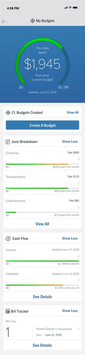
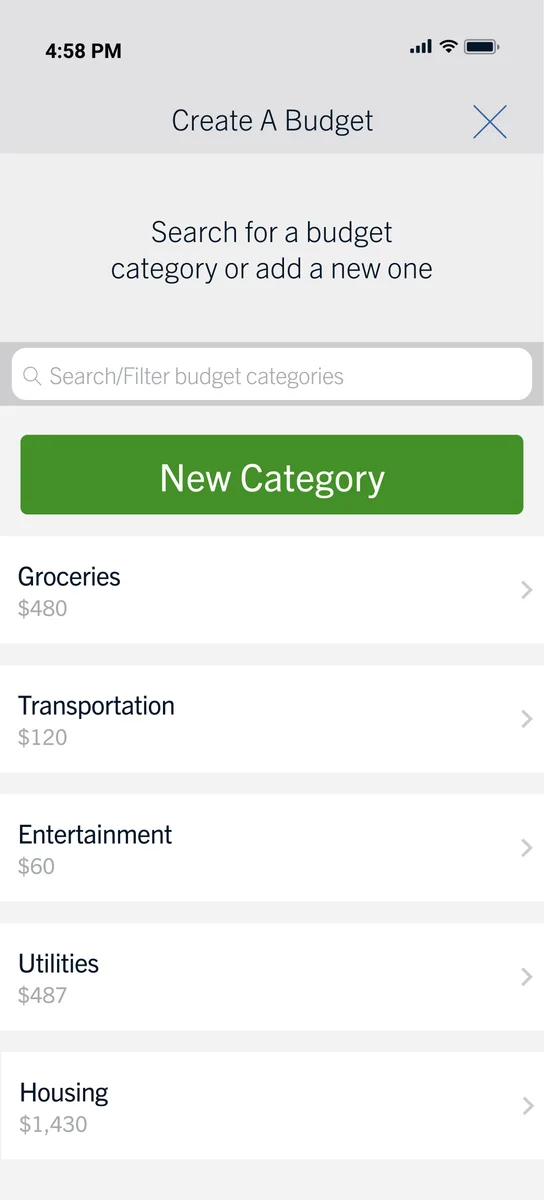
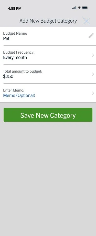
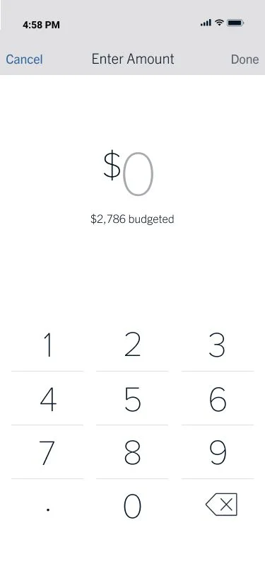
Budgeting flow screen placeholders
-
01Budget Summary
-
02Budget Category
-
03New Category
-
04Amount entry


Information architecture
Twenty-nine features do not become twenty-nine places.
They collapse into the four questions a person asks about their money: what am I saving toward, am I spending more than I meant to, what is about to come out, and where is the money going over time.
Goals, budgets, bills and cash flow became the reachable structure. Filters, custom categories, overspending alerts and scheduled reports happen inside those four. Anything that could not find a home had to justify becoming a fifth, and nothing did.
What the tool is made of
Four jobs, reachable from one screen.
A home summary card leads to four tool areas: Goals, Budgets, Bills and Cash flow. Each area answers one money question and contains related features rather than becoming a separate destination.
Home
One summary card per job, each with a status line and a way in.
Goals
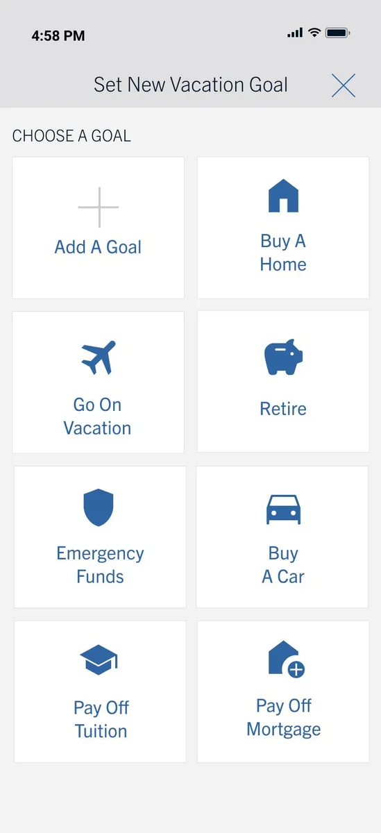
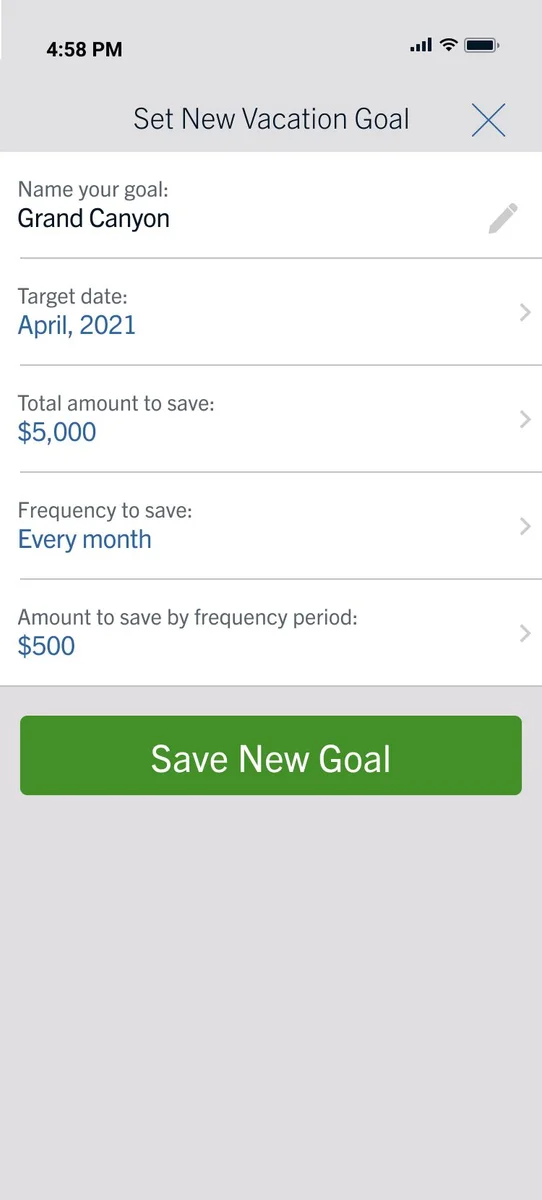
“What am I saving toward?”Six starting points: buy a home, go on vacation, retire, emergency funds, buy a car, or start from scratch. A goal has a name, date, total, and contribution frequency.
Budgets
“Am I spending more than I meant to?”Suggested categories or custom ones. A budget has a name, frequency, amount, and optional memo. The card shows the running total and whether it is on track.
Bills
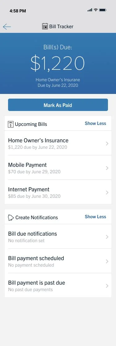
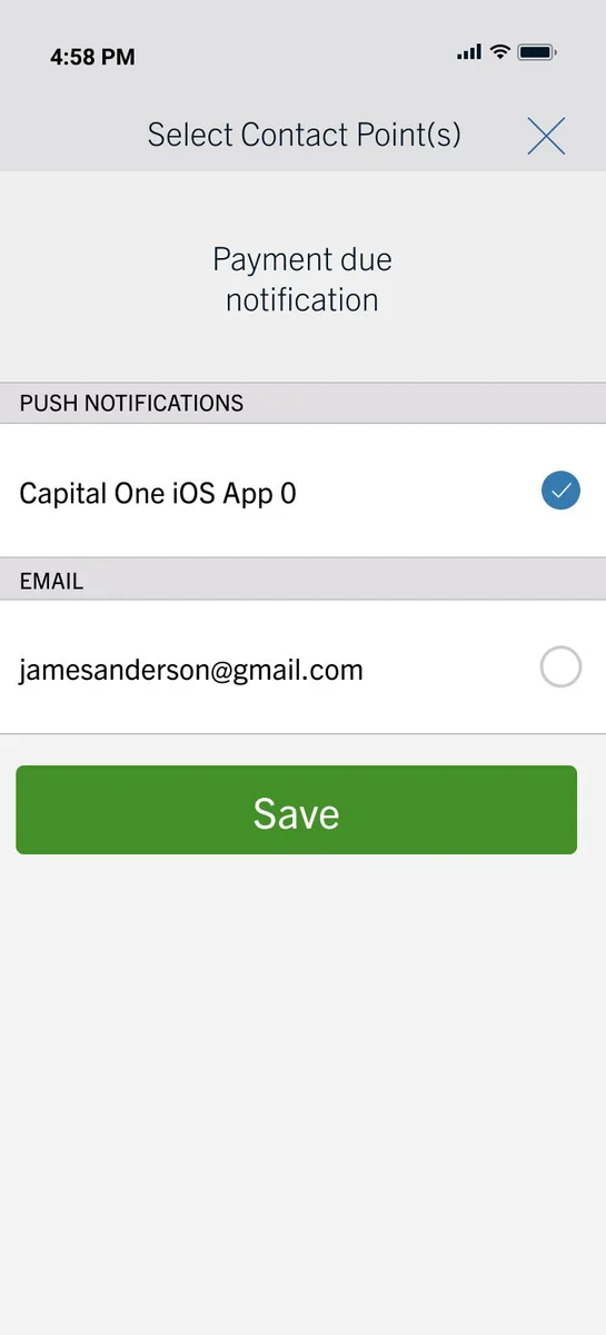
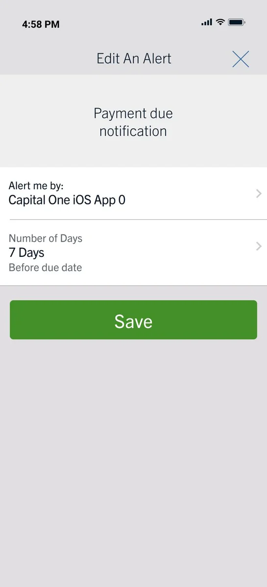
“What is about to come out?”Amount due and date due, mark as paid without leaving the screen, and notifications for due soon, scheduled, and past-due payments.
Cash flow
“Where is the money going over time?”Income against expenses, trends across tracked categories, and summary reports that go out on a schedule.
Why four and not fourteen
Twenty-nine features do not become twenty-nine places. They collapse into the four questions a person asks about their money. Filters, custom categories, alerts and reports happen inside those four.
Emotional design
Money arrives with emotion already attached.
People arrive at a budgeting screen already braced for bad news. A screen full of accurate figures with no interpretation makes that worse rather than better, so every summary answers the question before it shows the arithmetic.
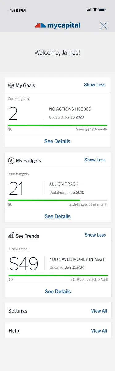
The goals card says two current goals and “no actions needed.” The budgets card says twenty-one budgets and “all on track.” The budget ring says $1,945 and “is looking good.” The credit score card already used the same pattern with 817 and “excellent.”
Verdict before number
Every summary answers the question before it shows the maths.
Four summary cards show current goals with no actions needed, budgets all on track, a budget ring that is looking good, and a credit score marked excellent. Two panels explain why a verdict reduces anxiety and why reassurance must be earned by accurate underlying data.
Goals card
2 current goals NO ACTIONS NEEDED The number alone asks the reader to work out whether two is good. The line beside it settles that in three words.Budgets card
21 budgets ALL ON TRACK Twenty-one budgets could be excellent management or total chaos. Without the verdict the reader cannot tell which.Budget ring
$1,945 is looking good! A large figure with no reference point is a source of anxiety. The line under it supplies the reference point.Credit card
817 EXCELLENT Borrowed from the existing credit score card in the parent app, which already worked this way. Consistency for free.The related decision on goals
Setting a goal starts with six tiles: buy a home, go on vacation, retire, emergency funds, buy a car, or add your own. None of them is a savings vehicle. They are all things that happen in life, because that is how people decide to save.
Where this could go wrong
A reassuring interface that is wrong is worse than a neutral one. “Looking good” has to be earned by the accuracy underneath it, which is the other half of why advice features waited.
A reassuring interface that is wrong is worse than a neutral one. Reassurance is a small promise. Advice is a large one, and you should not make the large one until you have kept the small one for a while.
Outcomes
What the design work produced.
- End-to-end ownership of one product, from an unsorted feature list to a tested interactive prototype
- A prioritized backlog of twenty-nine features across four tiers, each tagged with the user goal it serves
- User flows covering the four core paths, plus high-fidelity screens and a working Figma prototype
- A component library unifying the three core flows, which engineering built from
- Usability findings and A/B comparison results on calls to action and navigation, folded back into the design
- Accessibility guardrails on contrast, tap targets and error prevention
Walking through it
Two flows carry the interaction thinking better than any single screen does on its own.
Goal flow
Set a goal, three fields at a time.
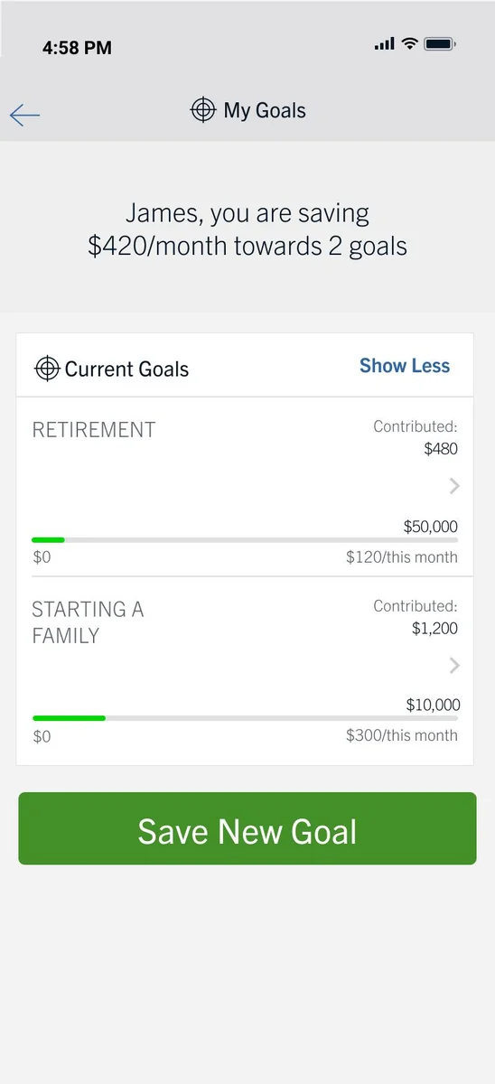
A four-stage goal-setting flow: Goals summary, Choose a type, Enter the details, and Saved. Existing goals are surfaced before the customer chooses a new goal type or enters its details.
Start with what is already true. Then ask only for the decision the customer needs to make.
-
01
Goals summary
Current goals and budgets stay visible first, so the whole picture arrives before the next decision.
-
02
Choose a type
Six life-event prompts and a blank start make the first choice feel familiar rather than financial.
-
03
Enter the details
Target amount, target date, and contribution frequency are the only new details needed to make the plan.
-
04
Saved
The goal returns to the overview with clear progress and a useful next action, not another empty screen.
What carries over from the overview
The entry point does its share of the work.
The account-home summary tells the tool what it can. The flow only asks the customer for the part that requires a choice.
Budgeting flow screen placeholders
-
01MyCapital Overview
-
02Goals Overview
-
03New Category
-
04Goal Descriptions
Bill flow
Surface the due date before the login does.
A four-stage bill-tracking flow: Budget and cash flow, Bill tracker, Bill detail, and Back on track. The flow surfaces the due date before asking the customer to log in or make a decision.
-
01
Overview
On trackBudget and cash flow
Review the month at a glance. Routine budgets stay quiet until they need attention.
-
02
Surface
Due soonBill tracker
Bring an approaching due date forward before the customer has to search for it.
-
03
Resolve
Ready to payBill detail
Keep the payee, amount, schedule, and paid status together in one focused view.
-
04
Return
Status restoredBack on track
Refresh the total, next due date, and reminders in the same overview.
Design principle
Being on track is quiet. A bill due soon is not.
Budgets can wait to be opened. A bill due soon cannot, so the system surfaces it one level higher than everything else.
Budgeting flow screen placeholders
-
01Bills Overview
-
02Budget Category
-
03New Category
-
04Amount entry

Attribution
A product team effort, with clear ownership.
A product team effort, with business stakeholders, research participants and engineering shaping what got built; my ownership was the research synthesis, the flows, the high-fidelity screens and prototype, the component library, the usability and comparison testing, and the interaction and accessibility specifications. I ran the sessions and comparisons but no longer hold the data, and this is the oldest work in the portfolio: the thinking holds up; the visual craft is of its time.